Find Best Route Anywhere

Client


DrayEasy.Inc


https://www.drayeasy.com/


Client


DrayEasy.Inc


https://www.drayeasy.com/


Client


DrayEasy.Inc

Team


2 Designer

4 Engineers

Team


2 Designer

4 Engineers

Team


2 Designer

4 Engineers

Timeline

May 2023 - Sept. 2023


Timeline

May 2023 - Sept. 2023


Timeline

May 2023 - Sept. 2023

My Role


Research, User Interviews, Iteration Testing, Design System


My Role


Research, User Interviews, Iteration Testing, Design System


My Role


Research, User Interviews, Iteration Testing, Design System


OVERVIEW

OVERVIEW

What is 'DrayEasy'?

What is 'DrayEasy'?

DrayEasy is a Digital short-haul transportation Platform that Help Cargo Owners find best route price

DrayEasy is a Digital short-haul transportation Platform that Help Cargo Owners find best route price

short-haul transportation

Short-haul transportation refers to the movement of goods over relatively short distances. Short-haul transportation can be done by various means, including trucks, vans, and trains. Depending on the specific requirements of the journey.

Short-haul transportation refers to the movement of goods over relatively short distances. Short-haul transportation can be done by various means, including trucks, vans, and trains. Depending on the specific requirements of the journey.

Cargo Owners

Cargo Owners

Cargo owners are individuals, businesses, or entities that own and are responsible for the goods being transported as cargo. Cargo owners determine what needs to be transported, coordinate with transportation providers, and ensure the safe and timely delivery of their goods to the intended destination

Cargo owners are individuals, businesses, or entities that own and are responsible for the goods being transported as cargo. Cargo owners determine what needs to be transported, coordinate with transportation providers, and ensure the safe and timely delivery of their goods to the intended destination

What is the problem?

What is the problem?

DrayEasy already had the web application version. However, during the user interviews, we found that users frequently work outside their offices. The Web-based application don't enable users for real-time searches for routes, compare price and check notification while they are at the port.

DrayEasy already had the web application version. However, during the user interviews, we found that users frequently work outside their offices. The Web-based application don't enable users for real-time searches for routes, compare price and check notification while they are at the port.

DrayEasy already had the web application version. However, during the user interviews, we found that users frequently work outside their offices. The Web-based application don't enable users for real-time searches for routes, compare price and check notification while they are at the port.

What is our opportunity?

What is our opportunity?

The existing DrayEasy Web Application doesn't well-suited for users on the move. we need the Mobile Application

HOW MIGHT WE help cargo owner complete booking more efficiently and smoothly through mobile app ?

HOW MIGHT WE help cargo owner complete booking more efficiently and smoothly through mobile app ?

HOW MIGHT WE help cargo owner complete booking more efficiently and smoothly through mobile app ?

Impact

Impact

4 times in efficiency

4 times in efficiency

4 times in efficiency

Users can reduce time of rate checking and order placement from 15 mins to 3 mins. Increased work efficiency by 4 times.

200% active users

200% active users

200% active users

Once DrayEasy provided client access via mobile app, there was a upsurge of 200% in daily active users over a fortnight.

SOLUTION

Search and browse at anytime

The consolidated homepage enables users to swiftly and distinctly check route history and stay updated on industry news.

Remind, Check messages timely

Well - organized notifications can assist users in focusing on crucial information and avoid being inundated by excess data.

Remind, Check messages timely

Well - organized notifications can assist users in focusing on crucial information and avoid being inundated by excess data.

Compare, Visualize price easily

Interactive map, clear price display empower users to grasp comprehensive information effortlessly and make informed selections.

RESEARCH

How Mobile can incorporate with Web?

How Mobile can incorporate with Web?

Designing for mobile it's not merely directly translating the web interface. We initiated the process by conducting an analysis of the web application. Through this analysis, we identified additional features for the mobile version and areas where optimization could be implemented

According to the 3 pain points we analyzed from research and user interview, we will focus on thinking about the user flows of the Search route, notification and compare rate. According to the user flow, we did the 2 round of wireframe proposal to understand the key mobile page and how they navigate to the next one.

01 Non-hierarchy Information

As the starting page, users are confused about what to do next and how to search the route.

01 Confusing Homepage Layout

As the starting page, users are confused about what to do next and how to search the route.

01 Non-hierarchy Information

As the starting page, users are confused about what to do next and how to search the route.

02 Complicated Rate Comparison


Users complained that they feel overwhelmed by the massive and non-hierarchy information in one page

02 Non-hierarchy Rate Information

Users complained that they feel overwhelmed by the massive and non-hierarchy information in one page

02 Complicated Rate Comparison


Users complained that they feel overwhelmed by the massive and non-hierarchy information in one page

03 Uncategorized Notifications


The notification center can quickly become flooded with thousands of updates.

03 Uncategorized Notifications

The notification center can quickly become flooded with thousands of updates.

03 Uncategorized Notifications


The notification center can quickly become flooded with thousands of updates.

What can we learn from similar products?

What can we learn from similar products?

We conducted an analysis of 6 freight-related apps in the market. Our aim was to compare the design disparities between the web and mobile platforms then find the the unique characteristics of mobile interfaces

We conducted an analysis of 6 freight-related apps in the market. Our aim was to compare the design disparities between the web and mobile platforms then find the the unique characteristics of mobile interfaces

Takeaway:

• Mobile app break down a long process into several short steps.
• Mobile app is easy to track and remind orders updated progress.
• Mobile app has fewer data input steps.
• Break down a long process into several short steps.
• Track and remind orders updated progress.
• Fewer data input steps. Simpler user operations and processes.

What can we learn from users?

What can we learn from users?

We conducted 4+ interviews with 5 industry experts resulting in clarifying user journey and defining pain points. Our aim was to understand their working mode and preferences.

We conducted 4+ interviews with 5 industry experts resulting in clarifying user journey and defining pain points. Our aim was to understand their working mode and preferences.

GOAL 1

Identify Inefficiency points for Web App

Solve web pain points and better collaborate through mobile design

GOAL 2

Understand users’ info prioritization

List user feedbacks and determine mobile page layout priority

GOAL 3

Discover the users' scenarios and preference

Re-optimize mobile workflows to provide a user-friendly experience

Pain Points

Pain Points

01

Can’t search quotes easily due to chaotic information

02

Can’t receive notification in an organized manner

03

Can’t compare rates efficiently due to complicated steps

Ideation

User Flow & Wireframe

User Flow & Wireframe

According to the 3 pain points we analyzed from research and user interview, we will focus on thinking about the user flows of the Search route, notification and compare rate. According to the user flow, we did the 2 round of wireframe proposal to understand the key mobile page and how they navigate to the next one.

According to the 3 pain points we analyzed from research and user interview, we will focus on thinking about the user flows of the Search route, notification and compare rate. According to the user flow, we did the 2 round of wireframe proposal to understand the key mobile page and how they navigate to the next one.

According to the 3 pain points we analyzed from research and user interview, we will focus on thinking about the user flows of the Search route, notification and compare rate.

  1. Search Route

The focus of the search route is on how to make it easy and fast for users to search their desire routes and call up previous search records
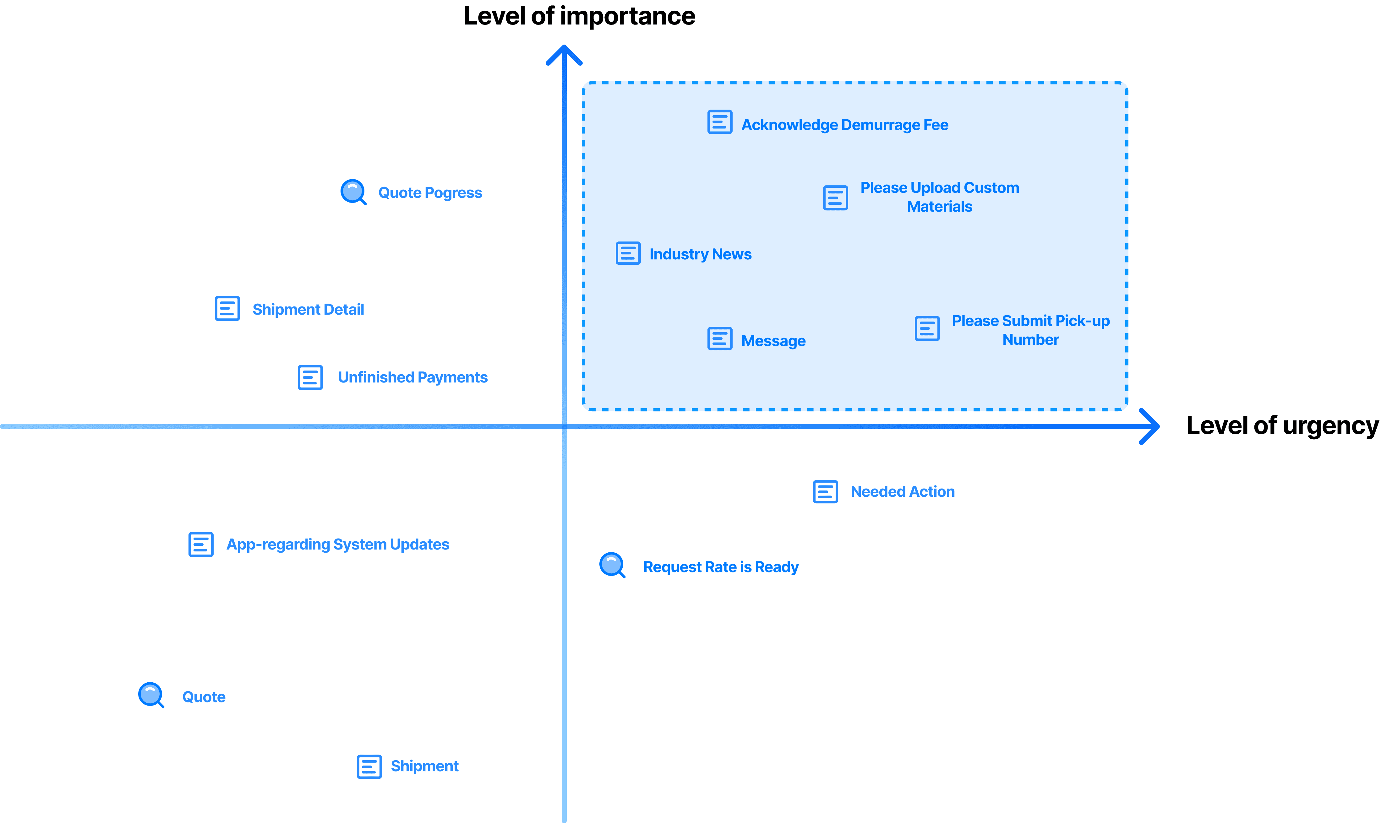
B. Notification

We hope that by categorizing alerts, users will not be overwhelmed by too many alerts and will be able to take care of important notifications in a timely manner.

C. Compare Rate

Need to allow users to better improve the user's understanding of the route and price, so that users can quickly and accurately make choices

Design & Iteration

During the design and iteration phase, we continued with 2 rounds of usability testing with previously users. Based on user feedback we made changes the layout and color of interface

  1. Search Route - Integration and Hierarchization

Through testing with users, we have improved the layout and structure of the homepage, the search filter and types, and the history route display

Final Design

Final Design

An integrated homepage is both concise and information-packed, offering users the ability to explore routes, review their search history, access real-time industry news, and receive crucial updates

B. Notification - Categorization and Prioritization

Narrowing down the final selections of notification to display on the screen with considerations of both high importance and high urgency. How can we categorize notification that don’t overwhelm the users

After reorganizing and classifying reminder categories, we are now contemplating how to integrate these classifications with the user experience

Final Design

Final Design

Creating a notification system that can differentiate reminders according to their category and level of urgency guarantees that our users remain consistently informed and manage without the risk of missing critical information.

Creating a notification system that can differentiate reminders according to their category and level of urgency guarantees that our users remain consistently informed and manage without the risk of missing critical information.

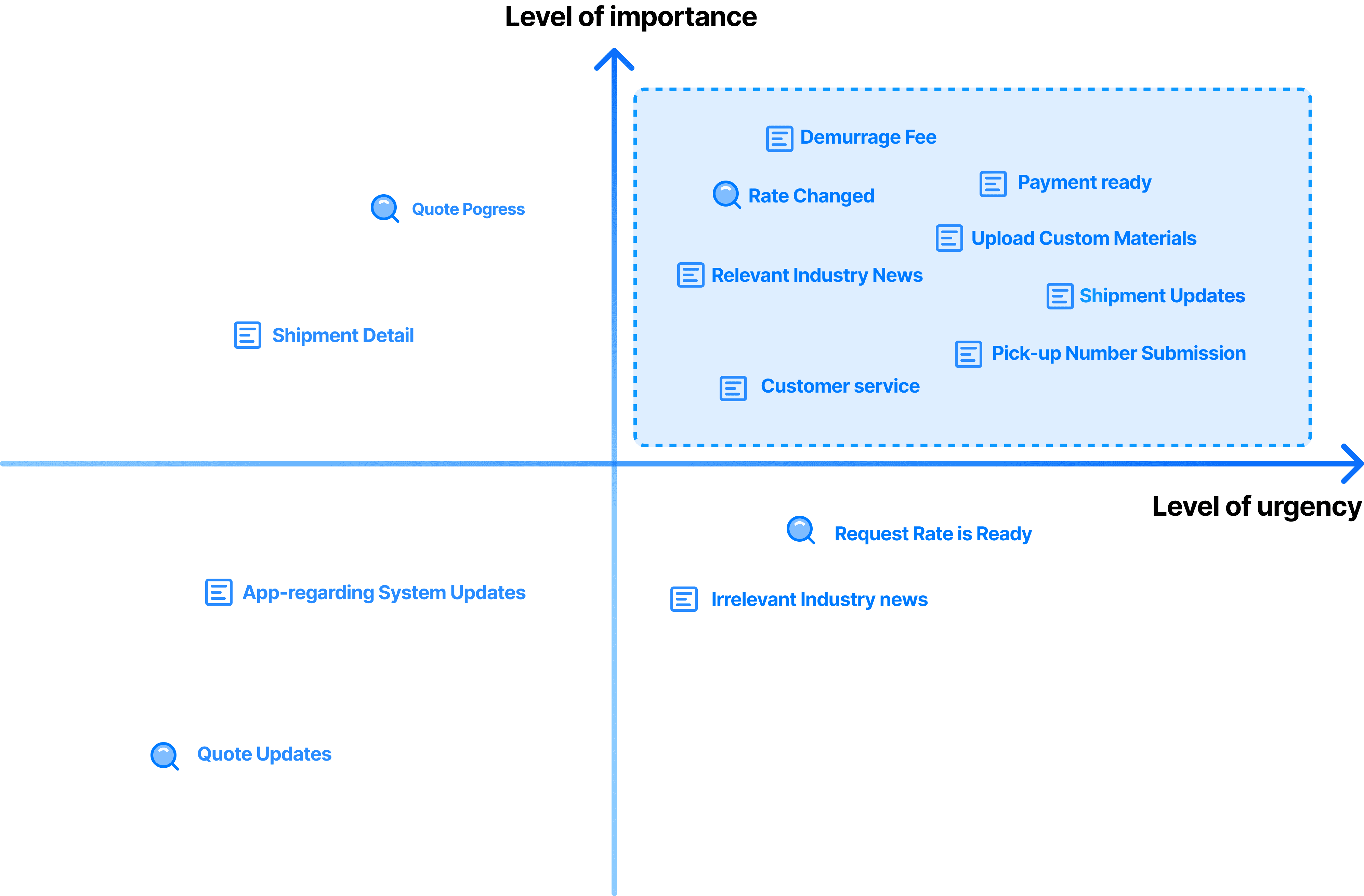
C. Compare Rate - Visualization and Interaction

For the compare feature, our main focus for improvement lies in effectively displaying routes and prices to enable users to quickly and clearly find the desired results

Final Design

Final Design

A revamped visual and information architecture made previously complex drayage options easier to digest, so that the user can focus on what’s truly relevant to make a choice.

A revamped visual and information architecture made previously complex drayage options easier to digest, so that the user can focus on what’s truly relevant to make a choice.

Design style

Build a Clean Visual System

Build a Clean Visual System

For the DrayEasy product, we defined Noto Sans Regular as our main text font to provide a sense of cleanness, elegance and technology. To guarantee legibility, semi-bold font styles for headings and regular styles for text body establish a clear visual distinction from title.


Concerning our color scheme, a deep blue was selected as our main hue, setting it apart from the four functional colors on the interface. The color coding complies with WCAG 2.0 AAA level standards for accessibility.

For the DrayEasy product, we defined Noto Sans Regular as our main text font to provide a sense of cleanness, elegance and technology. To guarantee legibility, semi-bold font styles for headings and regular styles for text body establish a clear visual distinction from title.

Concerning our color scheme, a deep blue was selected as our main hue, setting it apart from the four functional colors on the interface. The colour coding complies with WCAG 2.0 AAA level standards for ease of use..

Reflection

Adjustment following User's Scenarios and Preferences

Given the users' roles and device usage tendencies, the creation and tweaking of mobile application features must consider their use-cases. Enabling users to search routes, compare rates, and monitor updated status at all times and places is the essence of the design.

Cooperation among cross-functions team

During this project, not only did we collaborate with the design team, we also initiated numerous discussions with the product manager, the development team, and client. Gaining proficiency in accurately and efficiently conveying the ideas of the designer to different teams is of utmost significance!

Thanks for reading!

Thanks for reading!

Thanks for reading!

Let' s Connect!

qyuxiang@alumni.upenn.edu